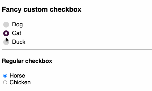
Custom radio button
Tired of the native radio button that the browser gives you? 😩 Too small? Too basic? Too blue? No hover color?
I hear you!
Here's a quick sandbox with some CSS tricks to get you started!
Highlights
opacity: 0 to hide the input
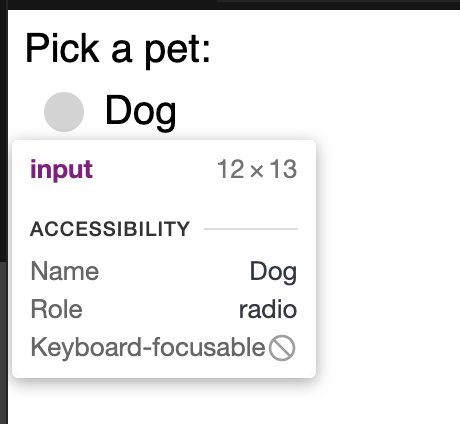
We want to hide the original input.
- ❌
display: nonecompletely omits the element. - ❌
visibility: hiddentakes up space, but stays invisible.
The above options successfully hide the element, but they make them invisible to screen readers.
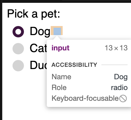
Here's alternatives that use position: absolute:
- 🤔
left: -99999999pxmoves an element off the page. It works but hard to debug, since it's there but nowhere to be found.
- ✅
opacity: 0hides it by making it completely transparent, and still "findable"
.container input {
  position: absolute;
  opacity: 0;
}
There's another one
clip-path: polygon(0 0), but still not very cross-browser ready
Go big or go home!
My main complaint about stock browser radio is it's too small!
.container .radio {
  position: absolute;
  top: 0;
  left: 0;
  width: 20px;
  height: 20px;
  background-color: lightgray;
  border-radius: 50%;
}
Note that our custom radio needs to be absolutely positioned to take the place of the original that is now hidden.
Hover
Hover effects make it even nicer!
.container:hover input ~ .radio {
  background-color: rgb(120, 91, 128);
}
Associate label with our custom input
There's two ways to do this:
-
Include an
idin the input and refer that label withfor<input type="radio" id="cat" /> <label for="cat"></label> -
Implicitly associate a label with a control by enclosing it
Source: w3 Label element specs
<label>
    <input type="radio" />
</label>
The 2nd one seems more appropriate in a custom radio, since we're enclosing the orig. input and the custom one.
<label class="container">
    <span class="label">Dog</span>
    <input type="radio" name="pets" value="dog" />
    <span class="radio"></span>
</label>
indicator using :after
We use a pseudo-element here to put the inner circular white dot (aka checkmark) when a radio is selected.
Since we styled the outer radio circle a bit bigger, we also made the checkmark bigger but keeping it in the center.
.container .check:after {
  content: "";

  position: absolute;
  top: 5px;
  left: 5px;
  width: 10px;
  height: 10px;
  background-color: white;
  border-radius: 50%;

  display: none;
}

.container input:checked ~ .check:after {
  display: block;
}
Have fun customizing your radio inputs!